Switching Trails to SwiftUI: Our Journey at REI
Declarative vs. Imperative Programming
When providing instructions for packing a backpack in an imperative framework, you would list each of the ten essentials and provide exact instructions on locating each item and fitting them all nicely within your pack. In a declarative framework however, you don’t need to meticulously outline these steps. You can instead define the result — a backpack packed with these ten items. The system then figures out how to obtain and fit them in the pack.
This of course, requires you to trust the system to choose the right items and arrange them correctly.
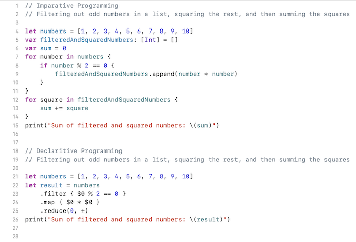
When it comes to computer programming, often there’s little doubt the system will do what you expect. Higher order functions like ‘map’, ‘reduce’ and ‘filter’ give us a taste of declarative programming. Rather than explicitly looping through an array and manipulating data, you can use these methods to declare what you want done and the system will perform the desired manipulation to each element.

The declaritive version of these simple list manipulations is half the length as the imperative version, and easier to follow.
When it comes to user interfaces however, there is much more ambiguity in the desired outcome. With that ambiguity comes a reluctance to relinquish control. Can you really trust the system to size things correctly on different form factors without explicit instructions? Will a long list scroll performantly without giving detailed instructions on how and when to create new views versus simply reusing old ones?
Declarative UI frameworks say yes and have been rising in popularity. In 2019 Apple put out their own declarative UI framework — SwiftUI.
Deciding to Declare
Like most iOS developers, we approached SwiftUI with some trepidation here at REI. The framework is still evolving and unlike longer lived frameworks, the answers to questions that arise might not yet be chronicled on StackOverflow. The benefits however are clear. The concise, descriptive SwiftUI code makes maintaining, refactoring, and reusing components much simpler than it was before. It also seems clear that it’s Apple’s preferred framework, with components such as Home Screen Widgets requiring SwiftUI. Navigating the SwiftUI learning curve seems inevitable for iOS development, it’s only a question of when.
With this in mind, we recently decided to move to SwiftUI for our retail employee app, Ascent. This was an easier decision for this app than most, as we have the luxury of owning the devices the app is deployed on. We can ensure everyone is on the latest iOS version, allowing us to use latest and greatest features of SwiftUI as they become available. The roadmap for the app also lended itself nicely to an overhaul. As we continued to add features to the app, it required a redesign of the fundamental navigation structure. This was the perfect opportunity to build a foundation of SwiftUI.
Navigating the Move to SwiftUI
We planned for all new development to be in SwiftUI, and to refactor existing screens to SwiftUI when meaningful changes need to be made. To set ourselves up for success, we adopted a SwiftUI architecture that would make refactoring existing UIKit screens as painless as possible.
Our UIKit architecture follows the Model, View, Presenter. (MVP) pattern. These presenters contain the business logic that setup the data (model) needed to a particular screen (view), and then communicates the necessary updates to the view. The communication between presenter and view are backed by protocols, allowing mock views for easy unit testing.
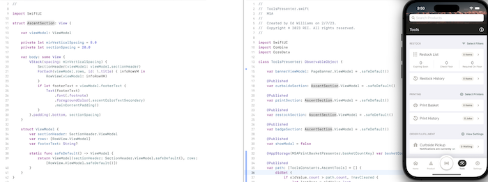
When refactoring an existing UIKit using MVP to SwiftUI, we were able to keep the presenters largely unchanged. The view however is replaced by a new SwiftUI view object, composed of one or many subviews. Each subview defines a ViewModel for anything that can change in it. Then, we can add these ViewModel objects as @Published properties to our presenters, and reference them as @State properties in the top level SwiftUI view. Instead of presenter invoking the protocol methods on the view, we simply update the viewModels to the desired state when appropriate. This ends up looking a lot like a Model, View, ViewModel architecture.
Our AscentSection component, its use in the ToolsPresenter as @Published properties, and resultant screen.
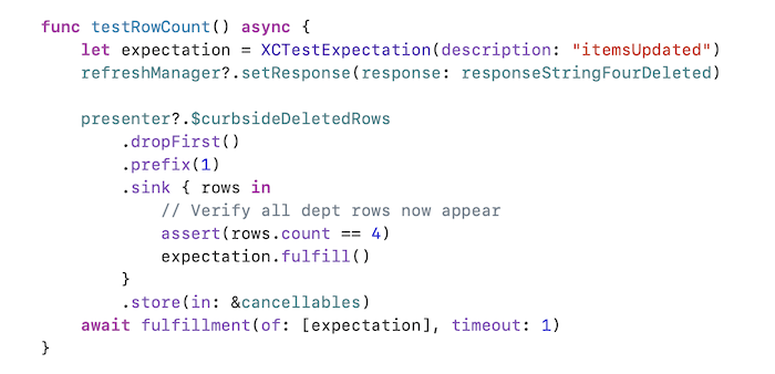
The result is very clean and modular view code that naturally lends itself to reusable components. We also retain testability for the business logic in our presenters. Instead of setting up mock views, we simply observe the @Published properties in each presenter and listen for the expected updates.

Developing in this environment can be a joy. Instead of being bogged down by boilerplate code and view lifecycles, one can focus on what really matters-— the look and feel of the app and the associated business logic. But unfortunately this isn’t always the case…
Bumps on the Trail
While the end result is clean, modular views, getting there can sometimes be a struggle. Simple things, like setting padding around a view can have one scratching your head until you realize that the order of applying View Modifiers matters. When you add them to a view, you’re not simply setting properties on an object as in UIKit, but as the name implies, you’re actually modifying the views. Luckily, despite SwiftUI being a newer framework, most issues like this are in fact Google-able, such as why a row with a Spacer element isn’t registering tap events as you’d expect.
The real struggle occurs when SwiftUI just doesn’t want to do that which you declare. We faced one such frustrating issue trying to allow users to switch their keyboard type while typing. In UIKit, this was as simple as adding toolbar buttons to the keyboard and setting the keyboard type on the UITextField. SwiftUI however handles a similar setup differently. Instead of changing the keyboard type while the keyboard remains on the screen, SwiftUI sees fit to dismiss the keyboard once changes to the type are made, requiring another invocation of editing mode for the new type to appear. This wouldn’t be too big of a deal as we can programmatically invoke the keyboard again with @FocusState — except this does not work in our case where a textfield is within a toolbar and you’re not at the top level of a NavigationStack.
In situations like this it can be very hard to determine if the problem is you, or a limitation of SwiftUI. Others were reporting similar issues here, and we ended up taking the advice posted on Stack Overflow and the Apple Developer Forums… Use the imperative UITextField wrapped in a UIViewRepresentable to achieve what we had before. With our philosophy of “everything new in SwiftUI”, this seemed like a step backwards. We want to set our app up for the future. Adding new UIKit components seemed like taking on technical debt, but in the current state of SwiftUI you do need to make some compromises – either on functionality or technical decisions.
Another challenge is performance. In the world of imperative programming, you can see where views are created and laid out, catching bottlenecks that may slow your app. Such details are abstracted away in declarative frameworks. This can lead to pitfalls where an update to a single textField can cause a cascading redraw of all views if you’re using a single view model for an entire screen as opposed to distinct components each with their own view model. In other cases, SwiftUI views don’t always do quite what you’d think they should. One could reasonably expect a SwiftUI List to act as a performant UITableView would, caching views and updating their content instead of constantly creating new views when scrolling. This however does not seem to be the case. When we used a List to display a large amount of search suggestions, we saw laggy non-performant scrolling. For performant scrollable lists, Apple recommends using a LazyVStack inside of a Scrollview instead. This did work well for us, but it does not seem very intuitive and was not the first thought for fixing our issues.
Looking Back
Our journey transitioning to SwiftUI was both rewarding and challenging. Over 70% of our Ascent’s views are now in SwiftUI. With a couple more releases we’ll get close to 100%. As components are built and knowledge in the framework is gained, the path ahead gets smoother—- both in developing new features and in maintaining and changing existing ones.
Despite the challenges along the way, the journey has been a success. This is in no small part due to the support of the entire team. Our product owner saw the value in adopting the new technology and supported the journey even though it meant less accurate estimates and an occasional change to better accommodate what’s possible in SwiftUI. Our designer composed new features with a set of building blocks, lending themselves extremely well to modular, reusable SwiftUI views. Our testers put the app through the wringer, finding easily overlooked issues and updating UI tests to work with the new layouts. Our project manager kept us focused and moving in the right direction while our backend engineer ensured we didn’t have to struggle to get the data we need. And our architect gave us the nudge to go blaze this trail, giving backup when things got challenging.
Looking back, we are now left with the concise, maintainable view code we were looking for. We’ve also gained vaulable experience in SwiftUI and declarative frameworks that will servce us well in the future. With Android and other platforms also adopting declarative frameworks, the specifics of each platform are becoming less and less important. Perhaps some day in the near future we won’t have to worry about platform dependant view code at all– we’ll be able to simply declare how we want the app to look across platforms.

So, can you trust SwiftUI to pack your backpack? Yes, but make sure to double check the result and be willing to provide some imperative steps if the batteries on your flashlight need changing.


