Accessibility + content design: a powerful combo to make you a better developer
A silly story that helps illustrate the benefits of understanding both accessibility and content design.
Introduction
If you didn’t learn about accessibility when you were learning development, you’re not alone. Even today it’s rare to find a development course offering more than a passing mention.
Writing accessible code, at its core, means writing code correctly. When combined with accessible content design, it will make your site generally more usable.
But more importantly, it enables people with disabilities to experience, and use the internet. In the world we live in today, that is unquestionably a human right.
Learning accessibility is no small task. There is much to learn, but it can be broken up into phases. Many certification courses will provide study outlines, or you can create your own. No matter how you choose to learn, it is well worth the effort.
Here are just a few of the basics:
You’ll learn about WCAG (Web Content Accessibility Guidelines), which will give you:
- A framework to help you understand the basic concepts of accessible web content.
- Success Criteria that provide techniques and a framework for testing your work.
- A deeper understanding of how an inaccessible web impacts people with disabilities.
You’ll learn about ARIA (Accessible Rich Internet Applications), which has:
- A library of existing patterns for web components in the ARIA Authoring Practices Guide (APG).
- The expected keyboard patterns for these components.
- Best practices around designing keyboard patterns for novel components.
- Roles, states, and properties of elements on the web.
You will dive deeper into semantic HTML, and understand why it is critical for those using assistive technologies.
Some examples of how this knowledge will benefit you as a developer:
- Your perspective will be more inclusive. Not all users use a mouse. Not all users can see the screen. You’ll move away from this “default thinking.”
- Your code will be more performant. Semantic and well-structured code requires less scripting and fewer DOM nodes.
- Your code will be SEO-friendly. Using semantic elements and avoiding duplication of content is good for SEO rankings.
- You’re less likely to create device-specific bugs. Alternative input methods will be top-of-mind. Using built-in browser functionality is more reliable than custom coding.
- You will be more confident. You’ll learn to quickly break down designs into known components and patterns.
- You will be more efficient. You’ll see design issues in refinement, instead of bending over backward to fix them in code.
- You will be more employable. This case study notes that “A study reported that web designers with competence in solving accessibility problems are more employable.”
How content design thinking and accessibility work together
Content design is about determining the best way to present the info people need to get stuff done—before getting into detailed interface design. Once the content and story interactions are clear, the design should center around that story flow and reinforce it.
Developers can play a role in this by helping to preserve the meaning of content when they see it getting lost in design translation. It can be a strong habit to look at a visual design and immediately start converting it into a layout. But by seeing a design first as a content outline, it becomes easier to recognize potential issues.
Many of the skills you gain learning accessibility support this kind of thinking. We’ll use an example to demonstrate this in action.
Starting with a visual design, we’ll examine how the average developer might start to break this down conceptually.
A story of space creatures
For this mental exercise, we’ll put together a fake team:
- Ted: The designer. He’s new on the job, but he’s doing his best.
- Chadwick: a traditionally trained front-end developer.
- Allie: a front-end developer who trained in accessibility best practices.
We’ll pretend this design contains actual content and not Forcem Ipsum.
This is how the design came in from Ted.
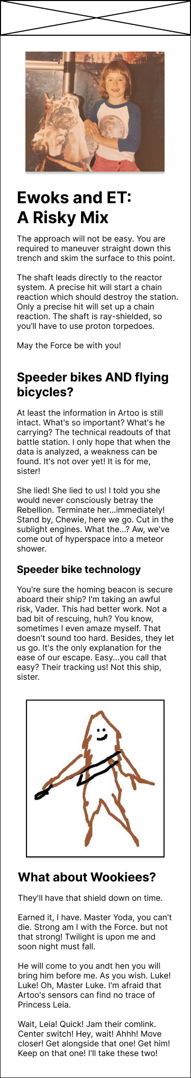
Shown above: The mobile version of the layout, showing the content in understandable reading order. The full text of the layout is below, but it is not necessary to read it to understand this article (maybe just to get a laugh).
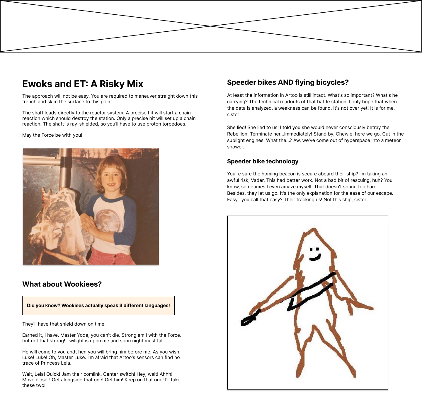
Shown above: The desktop version of the layout.
In this version, the content appears to be in two columns, and the order has changed. Now "What about Wookiees?" comes right after the opening section, and the image of the Wookie has moved to the end of the content.
When the team meets to review the design before development, Ted asks if there is anything that needs clarification.
Chadwick’s review
Chadwick thinks about the visual design and how it compares between desktop and mobile. He looks at which elements shift, and thinks about how to do this with CSS. He notes a few things:
- It’s clearly a column design on desktop.
- The elements are in a different order between desktop and mobile. He thinks through ways to handle that:
- CSS Grid? Maybe. He could rearrange the content with grid-template-areas. But with the column design, he would likely have gaps as the page resized. Any answer to that is likely to be quite fussy, but possible.
- He could duplicate the content and use CSS to show/hide the areas at different breakpoints.
- He could use a buffered resize listener to move the content on page resize.
- Other than that, it’s just basic elements - heading, text, and images.
Chadwick asks Ted asks a few questions about how the page layout changes at different breakpoints. Other than that, he thinks he’s got it.
Allie’s review
Allie takes a content-first, accessibility-focused approach. For this design, she considers:
- Semantic HTML and reading order.
- The way assistive technology will interact with the page.
- Other ways that users might experience the page, or change the display.
This brings a few things to light:
- There is non-text content (images) that will need alternative text for those who can’t see the screen.
- The banner under the “What about Wookiees” heading only exists on desktop.
- The design dictates a change in reading order.
She addresses these issues one at a time.
(#1) Missing alternative text
She asks about #1 (alternative text for the images) first. Ted quickly scratches out some alternative text, and their project manager adds it to the ticket:
- Image 1: “An eight-year-old child with a bowl haircut, wearing pink corduroy pants and a baseball shirt with blue arms and E.T. on the front. She stands holding a cardboard cutout of an Ewok, in front of a Star Wars backdrop.”
- Image 2: “A line sketch of a Wookiee, by an artist who is clearly quite skilled.”
(#2) Content exists on the desktop layout that is missing on mobile
Allie asks Ted about the “Did you know…” banner that is added on desktop. Ted decided to add this to give the page a bit more visual flair and help with the layout balance.
Allie frowns. “So if someone uses a screen magnifier, they may trigger the mobile version of the page. That content will essentially never be available for that person. That’s also a violation of WCAG Success Criteria 1.4.4: Resize Text (Level AA). Is that content important?”
(#3) Changes in reading order
She does a mental outline of the hierarchy and changes in the reading order.
For now, she leaves out sectioning elements, like <article> or <section>. However, she notes that they would be difficult to use properly on the desktop version.
- img: Ewoks and et picture
-
h1: Ewoks and E.T.: A Risky Mix
- p: related content
-
h2: Speeder bikes AND flying bicycles?
- p: related content
-
h3: Speeder bike technology
- p: related content
- img: Wookiee picture
-
h2: But what about Wookiees
- p: Wookiee-related content
-
h1: Ewoks and E.T.: A Risky Mix
- p: related content
-
img: Ewoks and E.T. picture
-
h2: But what about Wookiees
- p: Did you know? ...
- p: related content
-
h2: Speeder bikes AND flying bicycles?
- p: related content
-
h3: Speeder bike technology
- p: related content
- img: Wookiee picture
-
h2: But what about Wookiees
Looking at the content this way, she notes that the order of the content changes significantly on desktop.
One of these changes is fine. The picture related to the “Ewoks and E.T.” content still stays tangential to the content. Whether before or after doesn’t affect meaning or understanding.
However, the sections change reading order, and the Wookiee picture ends up no longer being in a section with its related text.
Allie asks Ted about this. He explains that he wanted the Speeder bikes section to be above the fold. The column design was mostly used to help the image layout.
“Unfortunately,” Allie says, “This will create a reading order that changes meaning on desktop. Not only for screen reader users—but also for desktop users that follow the vertical column flow to read. They will have a disjointed reading experience, where content is read out of order. This is a violation of WCAG Success Criteria 1.3.2: Meaningful Sequence (Level A).”
The pushback
Chadwick is looking a little annoyed at this point. “Allie,” he says, “it’s not our job to question the design, we just implement it.”
Allie shakes her head. “Sorry Chadwick, but it is our job to question a design if we can’t implement it in an accessible way. Not to mention, if the content retains the same order on desktop, there will be other benefits. Namely: performance, SEO, and code maintainability.”
“For example, duplicating content means extra DOM nodes, which is bad for performance and code maintenance. When that content includes heading tags, it can also be bad for SEO.”
Chadwick interjects: “Ok, fine, then we’ll use Javascript to move the content with a resize listener.”
Allie replies, “That covers SEO, but is still affecting reading order, performance, and code maintenance.”
“CSS grid? Rearranging the content in template areas?”
Allie sighs. “Even if you could get that to work, you still would have an issue with the reading order. And any changes in the content would mean reworking the grid.”
At this point, Ted jumps in. “No worries team. I had some of these thoughts myself when working on the design. I’ll take this one back to the drawing board for now, and we can look at it again in the next refinement session.”
The redesign
Two weeks pass, and Ted has come back with a new design. He’s thrilled to present it.
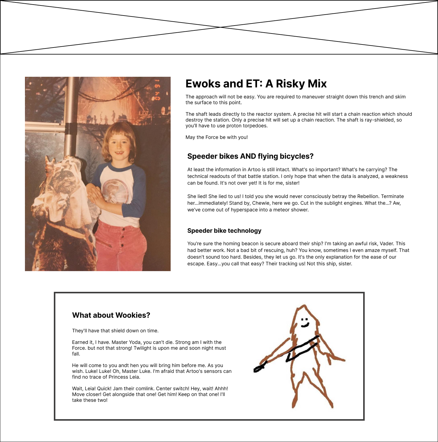
Shown above: The fixed desktop version of the layout.
In this version, the content is in the same general order as the mobile design. There are two rows this time. The first one has the image of the child on the left, and the paragraphs about "Ewoks and ET" and "Speeder bikes" on the right. The next row is centered with a border and contains the Wookiee-related text on the left, with the Wookiee drawing on the right.
“In this new design, I can show the full picture of this fashionable child, including these astounding pink pants. This design should also work better at tablet size than the last one did.”
Allie looks it over, doing a quick mental outline. Now all the content is in the same order/hierarchy, except for the Wookiee picture. But the picture is still tangential to the related content, so that’s fine. She gives a nod of approval. “It looks like you decided to get rid of that extra banner in the Wookiee section?”
“Yeah,” Ted smiles sheepishly, “that never really fit with the purpose of the content. It was just filler - so I took it out.”
Now both developers are happy with the design. Furthermore, Ted has learned to think in a more content-first manner, so his next design will take that into account.
Was it a little awkward at first? Sure. But in the end, these tough conversations result in an improved experience for everyone.
The new design has improved in many ways:
- It’s more performant and SEO-friendly.
- The page has a more natural and readable flow for all users.
- The code will be more maintainable, as it won’t need any hacks to work around an inaccessible design.
- The developer won’t have to interrupt the designer after they’ve moved on to the next project (for example, to ask for alternative text).
- And of course, the page will be accessible: delivering an equal experience for users with disabilities.
The bottom line is, you can’t take any design and make it accessible. If the design itself is not accessible, it is your place to speak up as a developer.
Both design and development are more likely to be accessible if they center around the content. If we can all align in that thinking, we can help each other improve.
Resources
Accessibility basics
- Web Accessibility Initiative (WAI) | W3C: A central hub for learning about accessibility fundamentals. Many of the resources provided below are within this space.
- Accessibility, Usability, and Inclusion | WAI | W3C: Understand how accessibility, usability, and inclusive design overlap, and their unique concerns.
- WCAG 2.1 Understanding Docs | WAI | W3C: A deep dive into each of WCAG’s Success Criteria, explaining the intent of the rule, who it benefits, examples, and suggested techniques to meet that criterion.
- WCAG (Web Content Accessibility Guidelines) | WAI | W3C: The official specification, for when you’re ready for all the details.
ARIA - Accessible Rich Internet Applications
- Using ARIA | WAI | W3C: 5 really important rules to know before using ARIA, plus other tips and best practices.
- ARIA Authoring Practices Guide (APG) | WAI | W3C: Component design patterns and examples, best practices, and much more.
- Accessible Rich Internet Applications (WAI-ARIA) 1.1 | WAI | W3C: The official ARIA spec. This is a lot to dive into without some basic background first, I suggest starting with the links above.
Semantic HTML
- HTML: A good basis for accessibility | MDN web docs: The basics of semantic HTML and the benefits it offers.
- Accessibility Through Semantic HTML | Laura Kalbag, 24 Ways: A great summary of the benefits of semantic HTML, and how to test your work.
Content Design
- What is content design? | Content Design London: A great intro for understanding content design and how it answers users’ needs.
- Writing is Designing | Michael J. Metts and Andy Welfle (book): How to approach writing for the web as a form of design.
- The Massive List of Content Design & UX Writing Resources | Prose Kiln: A list of books, articles, websites, courses, and much more.
Tutorials and resources for beginners
- Digital Accessibility Foundations Free Online Course | W3C WAI: An intro accessibility course for developers, designers, content authors, and anyone else who wants to learn the basics.
- Learn Accessibility | web.dev: A great overview of the basics, and a good reference.
- Testing Accessibility Courses (paid course) | Marcy Sutton: A well-known accessibility advocate, Marcy offers three levels of courses with a hands-on, simplified approach to testing the accessibility of your web pages.
- Introduction to Screen Readers (video) | YouTube, Tim Harshbarger (A11yTalks - February 2021): Tim teaches about screen reader basics and how testing with screen readers is different from the way they’re actually used.
Tools and reference
There are far too many tools to list all the good ones. This list is slimmed down to some of those tools I use on a regular basis. Start with a few and see how they work for you.
- How to Meet WCAG (Quick Reference) | WAI | W3C: A filterable quick reference list of all the WCAG criteria. A great way to find criteria by role, level, or subject (for example, “audio”).
- Accessibility Support (allysupport.io): Check elements, attributes, and more to find details on feature support. While not always 100% up to date, it’s still one of the best tools for this task.
- Accessibility Insights: A testing tool created by Microsoft, available for Web (Chrome and Edge), Android, and Windows. It offers the ability to scan your page for issues using the axe-core library, as well as tools that support manual testing.
- Screen Reader Keyboard Shortcuts and Gestures | Deque University: Great shortcut guides for lots of different screen readers, in web or pdf versions.
- Color Contrast Checker | TPGi: An installed application for Windows or macOS, it can test color contrast on live sites or design mock-ups with a simple eyedropper tool.