Launching Our New Design System: MVP Insights And Lessons Learned
To keep pace with new technology and digital platforms, organizations are increasingly turning to systems to help scale and cultivate a healthy environment for growth - and REI is no exception.
Design systems have emerged as a solution for digital product development teams to create a cohesive and consistent experience for customers across various touchpoints and channels.
Research shows that users crave consistency and companies that can provide consistent experiences across channels will quickly earn users’ trust and build credibility. Overall usability and learnability improve when similar elements have a consistent look and function in similar way. By solving for common patterns and style decisions in a standard way, the design language can scale faster to new products and allow product teams to solve more complex, interesting problems
Over the years at REI, we’ve had many forms of style guides and pattern libraries for our digital teams and partners to reference. In 2018, we took the next step to build a more robust design system of reusable UI design elements and UX patterns. This internal tool would become a shared resource for designers and engineers, helping teams work more productively and delivering a top-quality experience to our customers.
Our team has learned a lot from the transparency of other design systems, in addition to our own experiences, so we’re hoping to help grow our collective knowledge by sharing some of the insights we’ve gained from launching of our new design system.
Sowing the seeds
REI had an existing pattern library, named Cedar, that had been created as a central repo for reusable markup by a small team. That team disbanded after the creation of the library, and a sole developer struggled to maintain it and keep up with changing design standards.
From the experience with the Cedar pattern library, aka Cedar 1, we learned that we needed a more complete library of UI components that would be easy for both designers and engineers to use, and that would be maintained and enhanced with new design decisions and best practices.
A few passionate people made the case to upgrade the design system, building on what worked in Cedar 1, but envisioned as a more robust system with a dedicated team. Needless to say, their drive and persistence paid off, and in 2018 a team was funded to bring this new system to life, including the addition of my role as Program Manager for our Digital Design Systems.
Establishing roots
Knowing that a full buildout of all the components, foundations, and patterns we hoped to include in the system would take a good chunk of time, we were eager to release an minimum viable version of the system to satisfy our early adopters, and to start gathering user feedback to help inform future product development.
To plan what would be included in the MVP release, we identified the core UI components with the greatest likelihood of reusability across our digital portfolio. Then we established a process to design, build and document each of those components, and in early August we launched the MVP of our new and improved digital design system — Cedar 2.
MVP Lessons Learned
Importance of documentation
After a number of components started to flow through the design and build process, we were advised by a design system consultant about the importance of documentation for each component — to provide usage guidelines for designers and engineers, and to create a shared reference site that teams could use as a single source of truth.
Our initial target for MVP release was a fairly robust set of 35–40 components, with synchronized design and code assets. A few months ahead of our target release date for the MVP, our development work effectively paused as we played catch-up writing documentation. As you might expect, this increased scope pushed out our MVP release date, so we could launch a system with paired design assets, code assets, and full documentation.

In addition to writing documentation for the components that had already been built, we also had to build a website to host the documentation and establish a publishing process. Writing and publishing was a new skill for many on our team, and bringing on a technical writer helped immensely. Ultimately, we developed a system within our system for documentation and publishing — with editorial guidelines, templates for writing articles and component docs, and a release process to update the content on our website that has continued to evolve post-MVP.
While it would have been helpful to have all of this figured out from the start, we were committed to getting a basic version out the door for our users, and dedicated time on our roadmap to go back and review our content from a holistic view, to identify and address inconsistencies. And all the effort certainly has been worth it — since launch, we’ve found that our early adopters highly value our documentation as a single source of truth.
“Now, instead of just me pushing back [to requests off-standards], I can show them the official site. It’s empowering to have the back-up.” — UX Designer
“The documentation was super easy to figure out, using the system has honestly been very straightforward so far and has saved me a lot of time getting up to speed.” — Front End Developer
By capturing everything in the documentation, our goal is that anyone can reference it and start building with all the information they need, and know where to go to see the latest standards for our design.
Another major benefit was supporting onboarding for new colleagues, who embraced the in-depth guide as an invaluable resource as they acquainted themselves with REI. The documentation proved itself extremely useful as a reference to answer both design- and engineering-related questions newcomers might have.
Process on process on process
A challenge of doing something new is that in addition to doing the actual work, we also needed to establish a process to ensure we’re working consistently and efficiently.
Our processes to design and build components, document, and release to the doc site are all fairly granular. There’s certainly room to streamline and hopefully increase velocity, but we’re finding it helpful to try to capture all the possible steps, run through the process a few times, and then continually iterate as we learn more about what works and what’s necessary.
So far, we have been able to make some refinements, such as doing parallel design and technical discovery, which created a more collaborative discovery process and reduced hand-offs and wait time between design and development work.
 Cedar end-to-end component process (current iteration)
One downside of all our process was the perception, both internally on our team and externally on product teams, that our process is too complicated — so much so that potential contributors felt intimidated or overwhelmed by what we might ask them to do to add something to this system.
This is a challenge we’re still actively working through — searching for the balance between an accessible contribution model, and the need to keep high standards for what goes into the system to ensure the quality we promise.
Complexities of adoption
With the launch of the MVP came the next challenge — to move from the vision of design system efficiencies that people had bought into, to the reality of how adopting the new components would actually work.
We started meeting with product teams to introduce them to the system, learn about what was upcoming on their roadmaps as potential adoption opportunities, and understand any technical dependencies they had to get started.
Meeting with individual product teams and stakeholders was essential to initial communication about the design system. Often, teams had many questions specific to their needs, and the best way to get to a shared understanding about what we were delivering was to tailor the conversations to their use cases and key concerns.
We soon realized that our initial goals for adoption were too aggressive, when weighed against the reality of our situation. There were some technical hurdles we would need to surpass for all teams to adopt the system, as well as continually making the case to product managers to invest the time and effort to integrate our components now for the future benefits — slowing down now to speed up later.
Technical debt
While designers were eager to start using the Cedar UI toolkit in Sketch, a tool they were already using, the technical landscape was more complicated.
Like many organizations, especially those that are not digitally native, our digital platform is fractured as a result of inconsistent development processes and standards over the years.
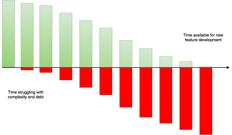
Technical debt can generally be harder for a business to prioritize, as it doesn’t directly relate to increased revenue, but over time the increased complexity accrues interest — incurring costs in terms of developer productivity, uneven quality, inconsistent user experiences, and less time available for new feature development.
 Opportunity cost (Image
Source)
REI has invested in building the Cedar design system to help address some of these issues and move towards a more modern digital foundation that will enable us to scale and quickly deploy design updates. However, initial adoption of Cedar 2 struggled, due largely to inconsistent front-end tech stacks and lack of shared processes across teams.
To break the cycle of ad-hoc processes and custom applications that drain our engineering resources, we needed to think more systematically about how we develop digital products.
While some tech debt is normal, our team is continuing to push design system adoption as an opportunity to minimize the long-term interest costs. To help demonstrate the value of the initial investment to adopt the system, we are looking at real-world scenarios, such as the rollout of a new typeface, to explain how future design changes become easier when they use system parts that are updated and maintained by the design system team.
A new digital foundation
When we began to build out the new design system a year ago, the team recognized that different pages and sections of REI.com were on different tech stacks, including a monolithic legacy platform and an assortment of microsites using different front-end frameworks.
Acknowledging the complex landscape, Cedar 2 components were built to be agnostic of any platform or framework, so that teams could consume components in whatever way they needed to.
But in digital, everything is constantly changing.
Soon after our MVP launch, we learned about a project being planned to build a new microsite framework supported by microservices that all the sites in our digital ecosystem could eventually migrate to. The project made a lot of sense and would enable our digital teams to continue to grow and scale efficiently, naturally aligning with the goals of the design system.
With increasing awareness of this project, we found that some key teams that we’d hoped would be early adopters had imminent plans to migrate to the new framework, and were hesitant to invest resources in updating the old thing while the new thing is being built. This was a wrench in our adoption strategy, but at the same time, we didn’t want to add technical debt or unnecessary rework for teams.
Rather than increase engineering debt and force adoption of Cedar 2, we adapted to take a more collaborative approach with the team building the new microsite framework. By integrating Cedar 2 components in the new foundational platform, we could enable mass adoption of the system and provide a uniform integration — helping achieve our ultimate goal of an invisible system that was so easy to use, our designers and engineers would never dream of using anything else.
Adoption is a journey, not an event
Initially, we created a progressive series of levels to help teams understand how they could adopt the design system — from non-adoption, to planning for adoption, adoption of core components, and ultimately full adoption.
As we started to track the progress of adopting teams against these levels we saw that there were some gaps, and that we weren’t capturing all the work needed to pave the way for adoption. For instance, some net new projects could jump to level 2 adoption (using core components) without all completing all the steps in level 1 (e.g. Cedar 1 audit and removal). Technical feasibility and external dependencies were also blocking some teams from progressing, and we wanted to surface those for greater visibility.
So, we got more granular.
Inspired by the sales conversion funnel, I mapped out the user journey for a team adopting the design system, where conversion = adoption.
By framing the stages of adoption as discovery, enablement, adoption, and loyalty, I was able to break down the various steps that teams would need to get to the next level. It also helped us see where each team was at in their journey, where they might be getting stuck or blocked, and where the Cedar team could help un-stick.
We continue to iterate on the adoption journey as more teams progress through the various stages and steps, and search for problem patterns to figure out how to make the path to adoption more seamless.
 User journey for teams adopting Cedar
Creating a sustainable environment for growth
While our early promises were to increase design and development efficiency and bring a consistent visual language to our products, we’ve found the design system to also be a driving force for other digital transformation initiatives.
The design system represents a mindset shift to systems thinking - creating and open border between disciplines and individual teams to develop reusable solutions and standards.
By providing a shared resource to help designers and developers understand each other, and a single source of truth that all teams can reference for the latest design standards, we hope the design system will be a key part of evolving our digital culture and practices.
Our team is still looking for other means to quantify and measure the value of our design systems, which there does seems to be a lack of industry standards around, even among the tight-knit design systems community.
In 2019, we’re exploring how best to enable automated tracking of system assets to determine where and how often they are being used, as well as auditing where they are not being used, to see if we’ll be able to compare the productivity of teams using the systems vs. not.
We also are expanding the scope of the products that Cedar can support, including mobile apps and third-party tools, to further promote a consistent and high-quality experience for our customers, as well as decreased costs for long-term maintenance.
As the system evolves and gets wider adoption, some of our next areas of focus will be to ensure we have standards for governance, releasing updates, and contributions to the system.
Ultimately, if teams are able to communicate and collaborate better with our system, we can work more efficiently towards our long-terms goals.
Go fast alone, or go further together


